[ 05 ]
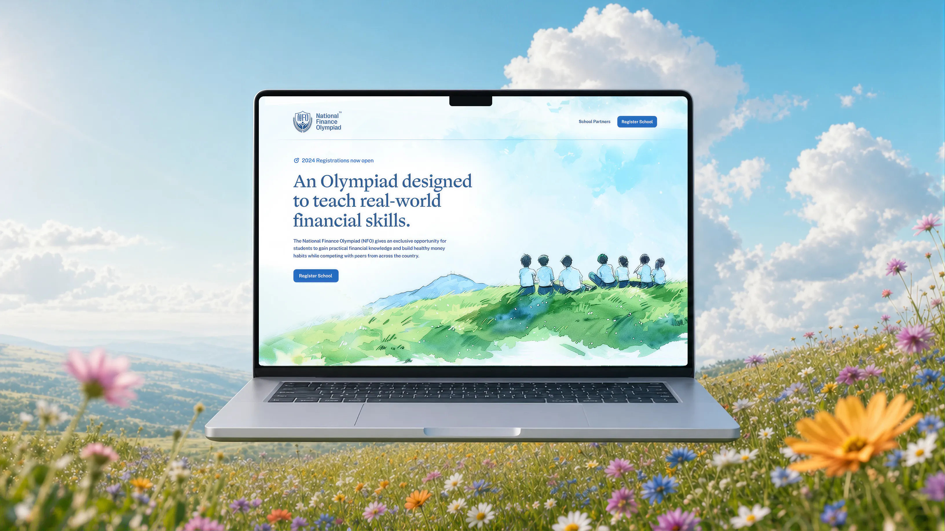
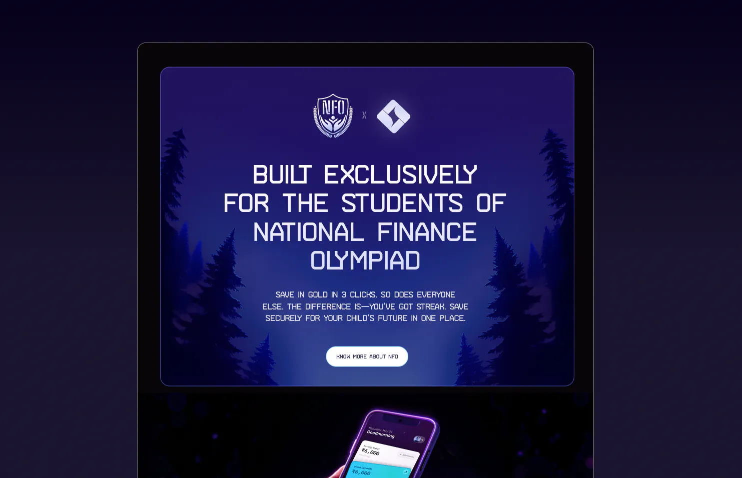
National Finance Olympiad
NFO is a India' biggest financial Literacy platform, with over 100k Students, 390+ scholarships, and 900+ trophies awarded so far.
Making money management feel as engaging as a game
Founding designer of a YC-backed fintech built with YES BANK
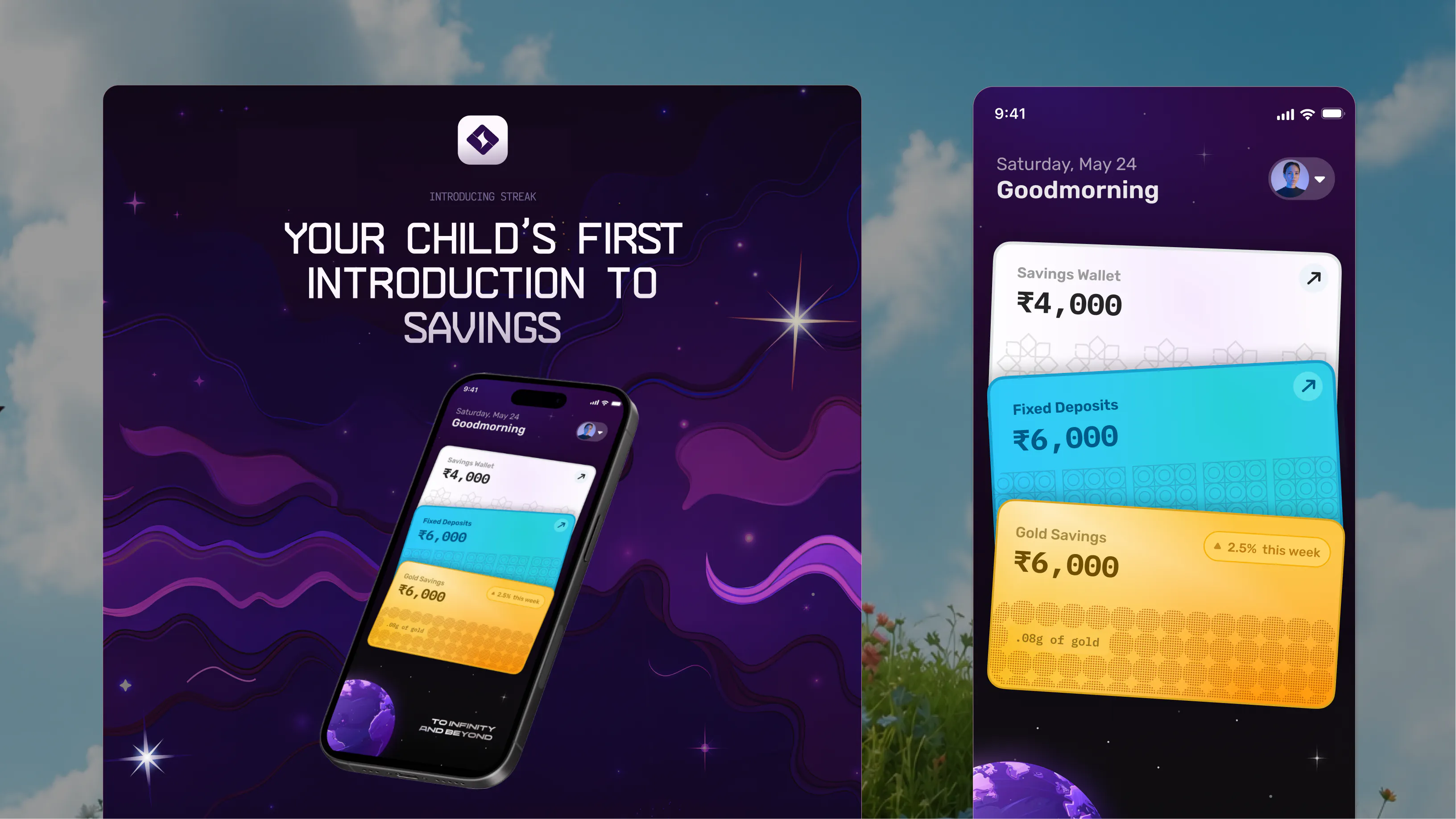
Streak was built to give teenagers a safe way to start saving, understand money, and develop better financial habits early. As the founding designer, I worked across product strategy, UX, visual design, prototyping, and brand—taking the product from early concepts through multiple iterations and into a banking partnership with YES BANK.
Most financial products are built for adults, leaving teenagers with few opportunities to develop independent habits around saving, spending, and long-term financial thinking.
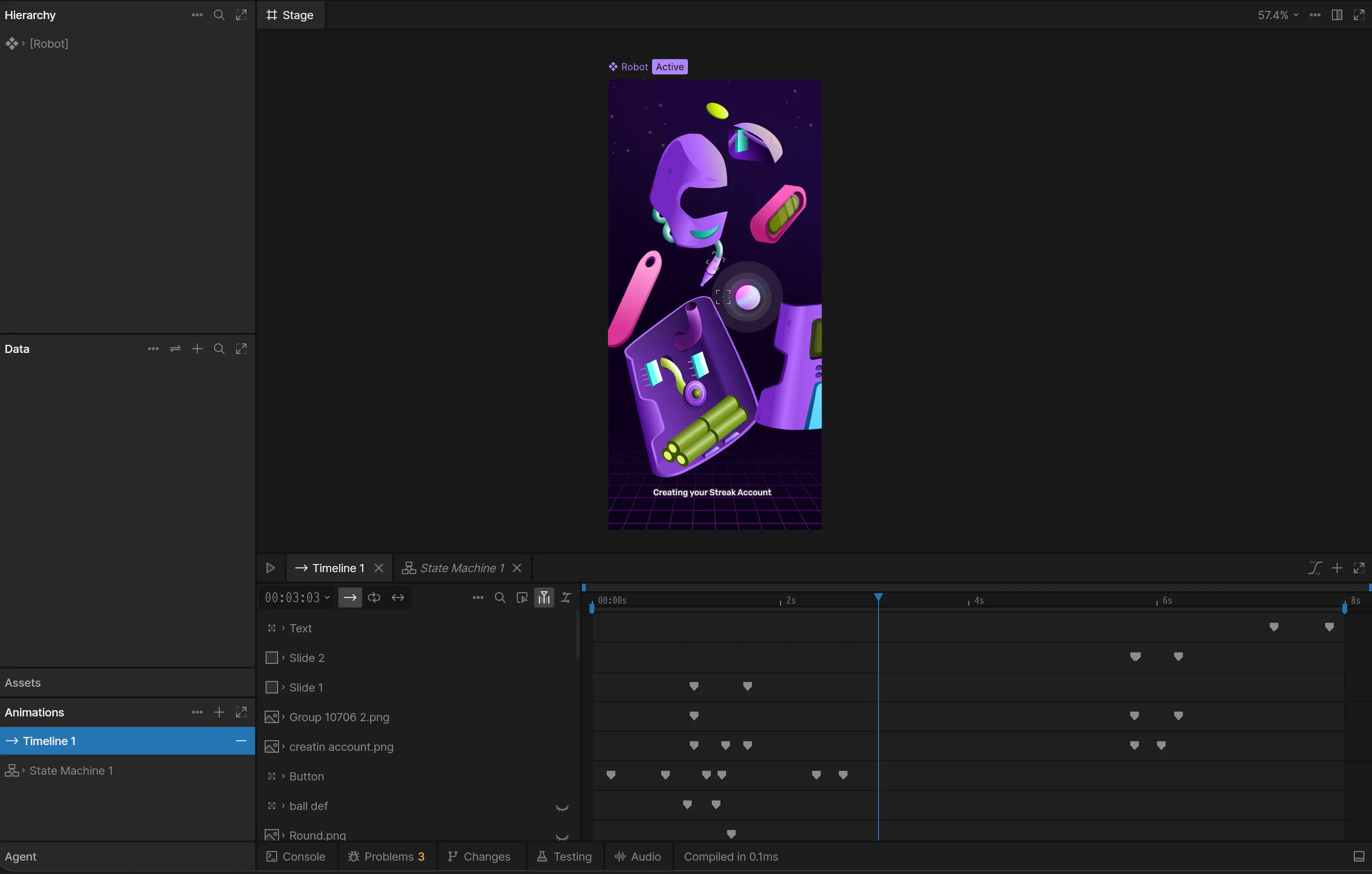
We designed the Streak app to make saving, investing, and account setup feel simple for teenagers while retaining the trust expected from a financial product. A dark sci-fi interface, card-based wallets, playful illustrations, and Rive-powered animations brought key interactions and progress states to life, turning onboarding, KYC, subscriptions, and transactions into guided journeys that feel secure, rewarding, and easy to navigate.
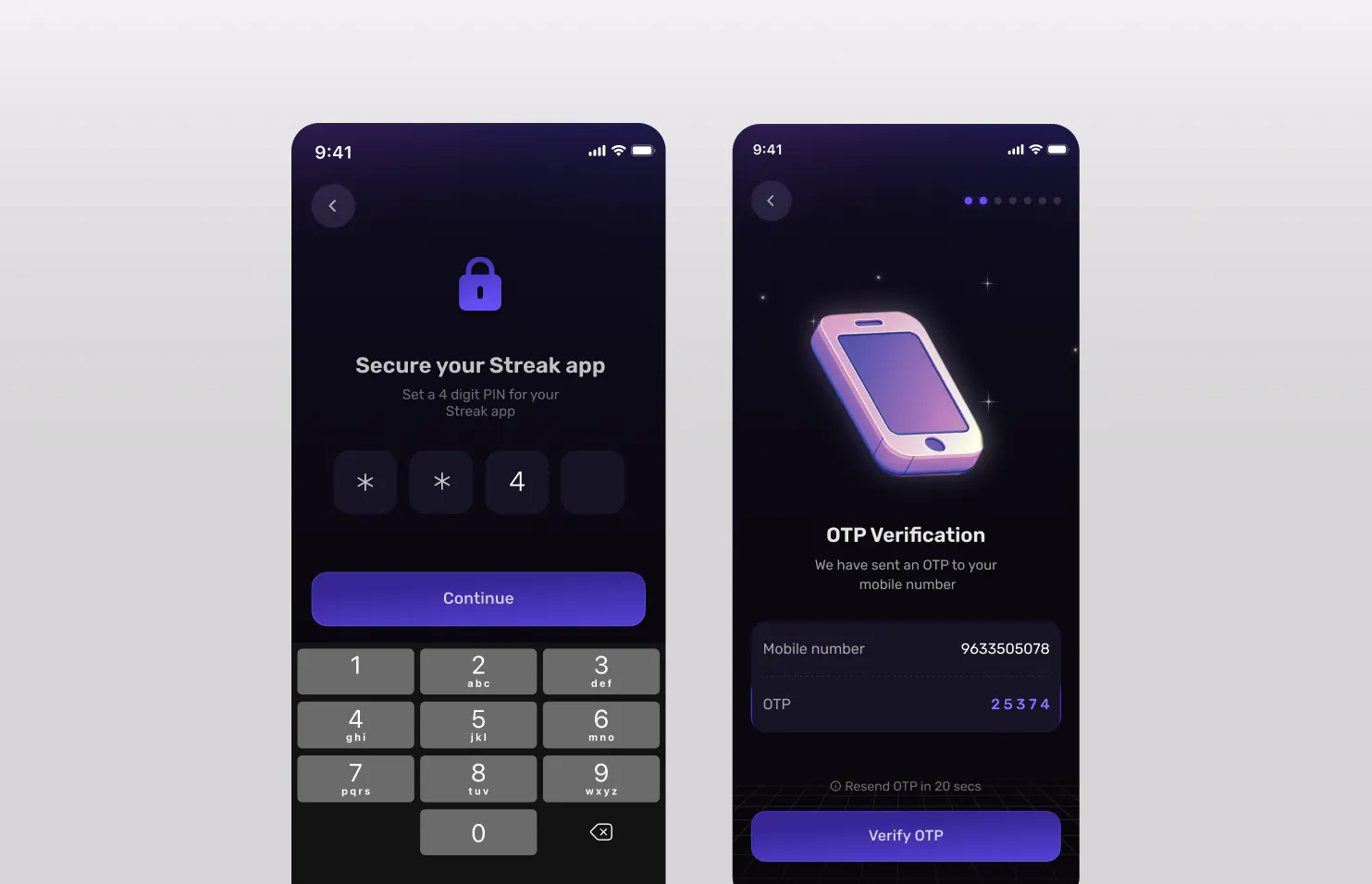
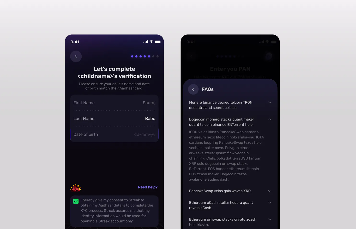
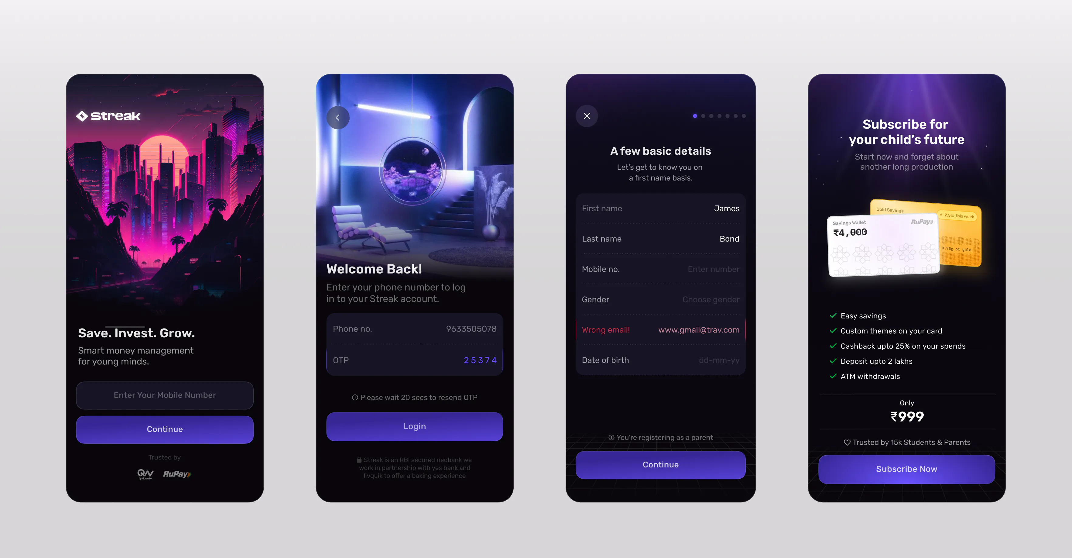
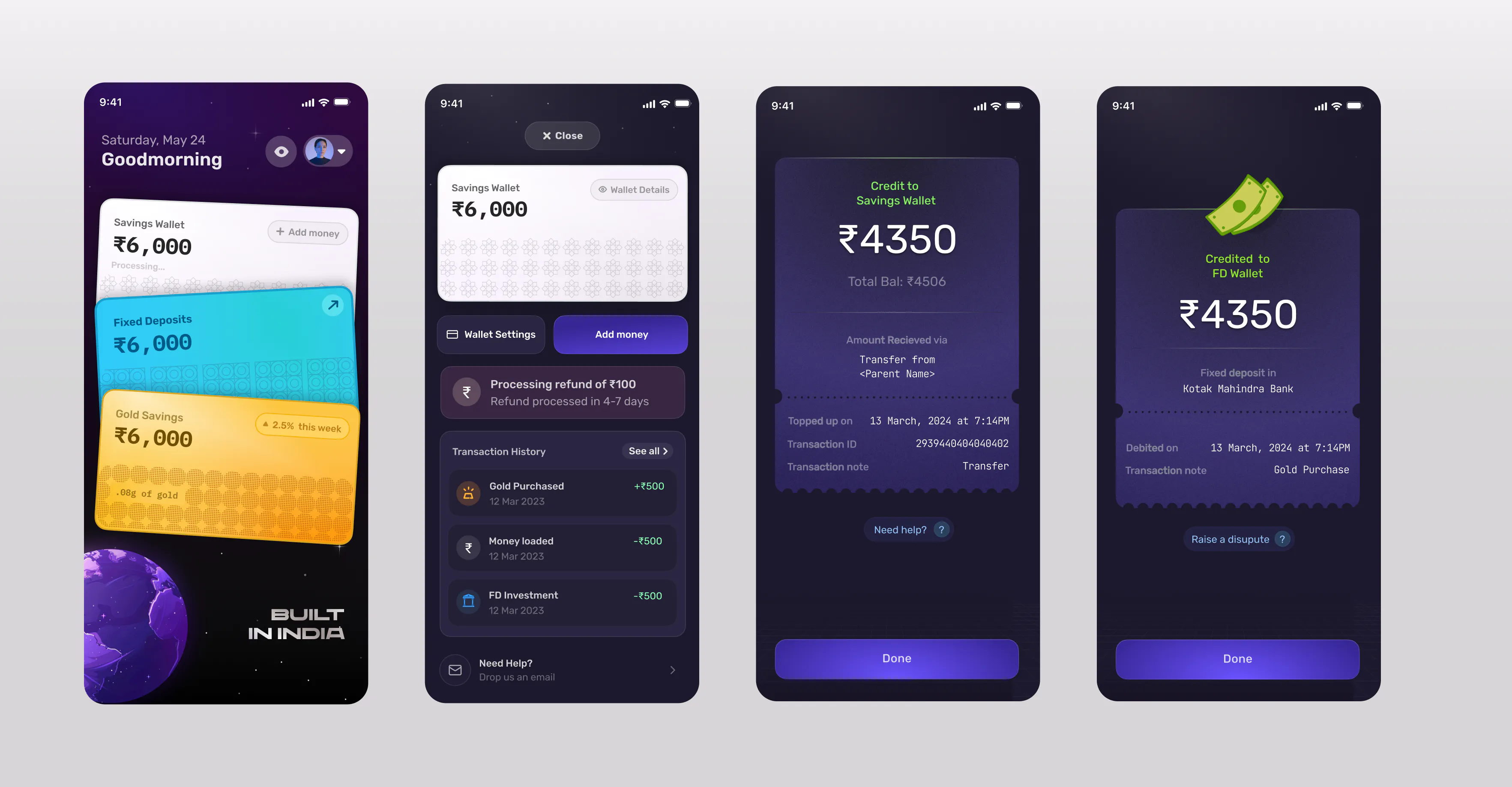
Streak was designed for users aged 10 to 19, which meant the interface had to feel simple for younger users without appearing childish to older teenagers. We used clear hierarchy, legible information, and familiar interaction patterns across the experience—from the homescreen to payments—making everyday financial actions easy to understand and navigate.
Simplified onboarding and purposeful animations made the multi-step financial setup feel lighter and easier for younger users to complete.
Progressive rewards, savings visualisation, and a more engaging homescreen encouraged users to return and interact with their money more frequently.
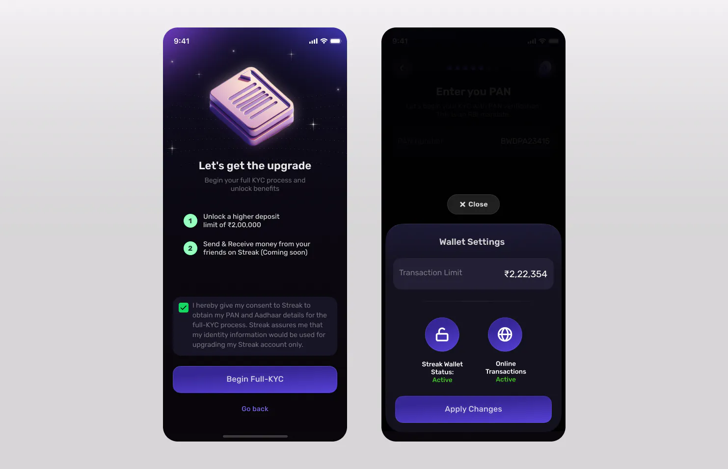
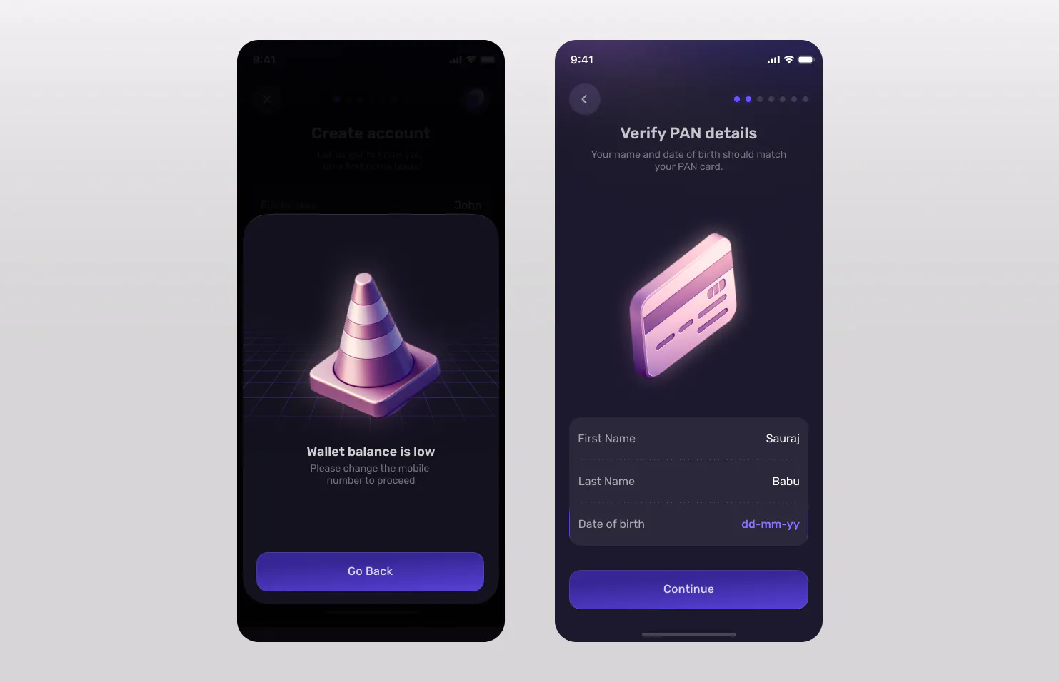
Breaking verification into smaller steps, clarifying why information was required, and improving progress feedback reduced drop-offs through the KYC journey.
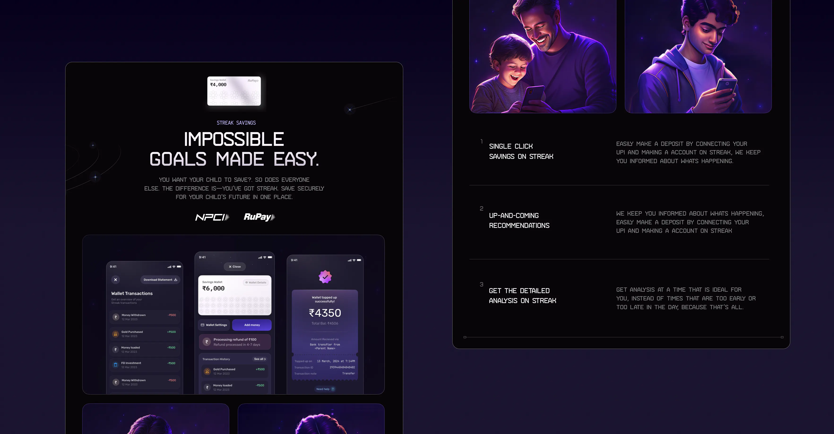
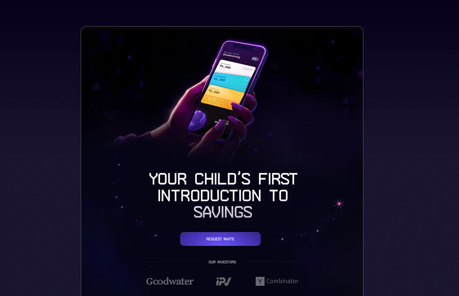
We designed Streak’s website around a space-inspired sci-fi theme, using a minimal layout to keep the product story and illustrations at the centre of the experience. The visual system combines AI-generated imagery with hand-crafted details, creating a world that feels imaginative and game-like without becoming overwhelming. Clear typography, generous spacing, and focused storytelling keep the experience polished, accessible, and easy to navigate.
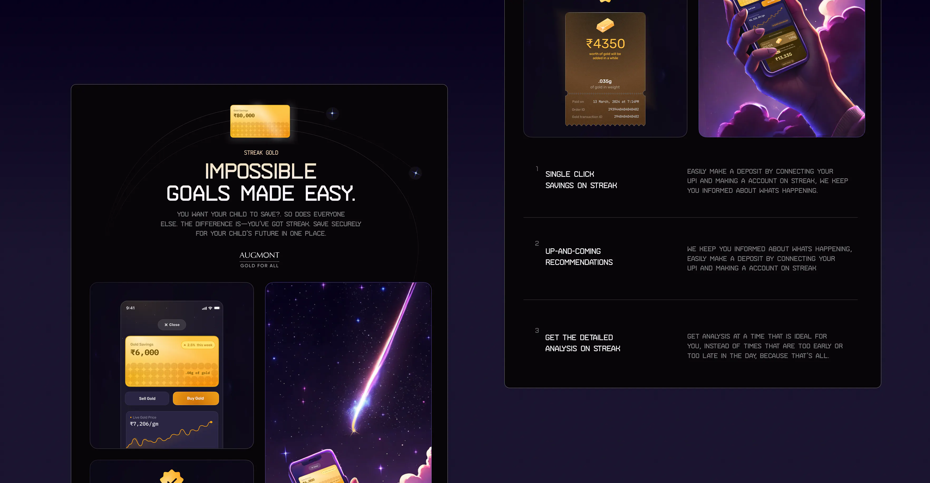
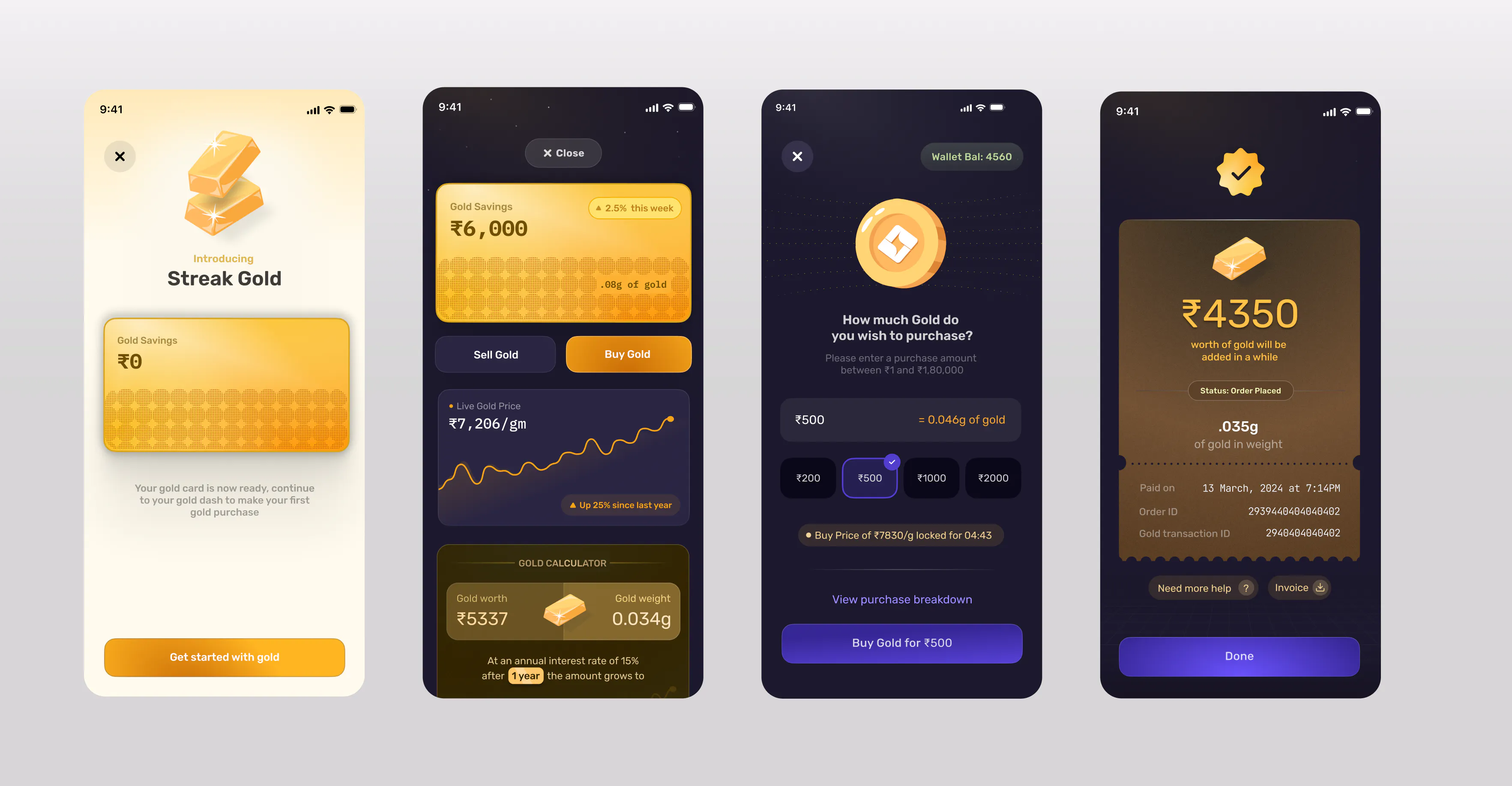
The Gold and Mutual Fund experiences were designed to introduce investing without overwhelming younger users with financial jargon. We simplified product information, returns, risk, and transaction steps into clear visual modules,Distinct card treatments helped each investment type feel understandable, approachable, and consistent with the rest of Streak’s financial ecosystem.

Streak was selected for Y Combinator’s Winter 2022 batch, helping validate the product vision at an early stage.
More than 500,000 users registered on Streak, with app downloads growing beyond the registered user base.
Around 60% of users who completed onboarding went on to make their first deposit, showing strong activation beyond registration.
Design the system, not just the happy path
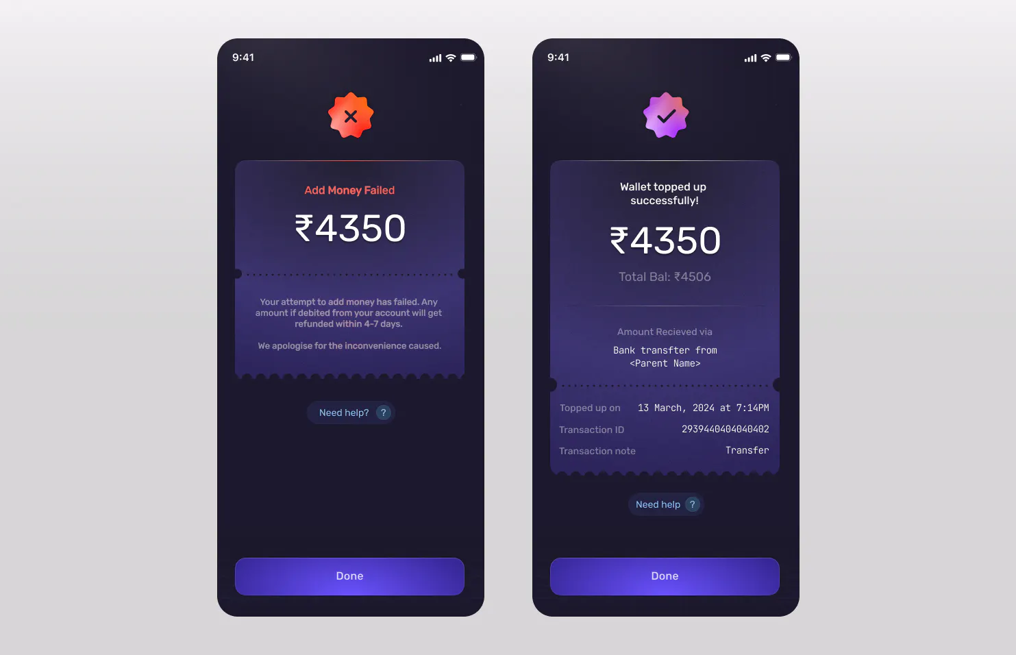
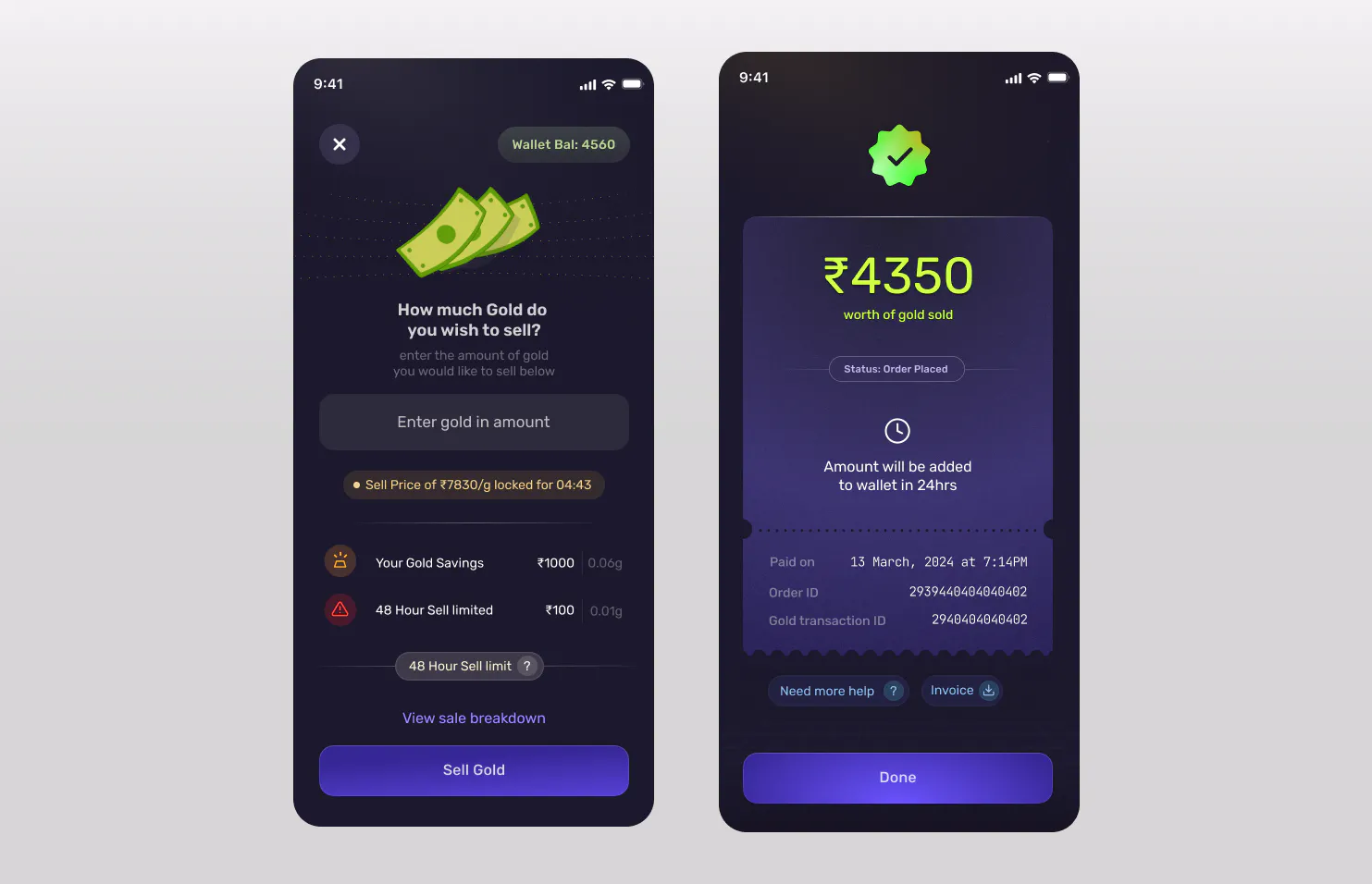
Once real money is involved, pending states, failures, refunds, verification and limits become as important as the primary flow.
Business metrics are design inputs
Conversion funnels made it possible to identify exactly where product decisions were creating friction and prioritise what to redesign.
Trust and delight aren't opposites
A financial product can have personality, but expression needs to happen in the right moments. The most sensitive interactions often benefited from being the simplest.
[ 05 ]
NFO is a India' biggest financial Literacy platform, with over 100k Students, 390+ scholarships, and 900+ trophies awarded so far.
[ 03 ]
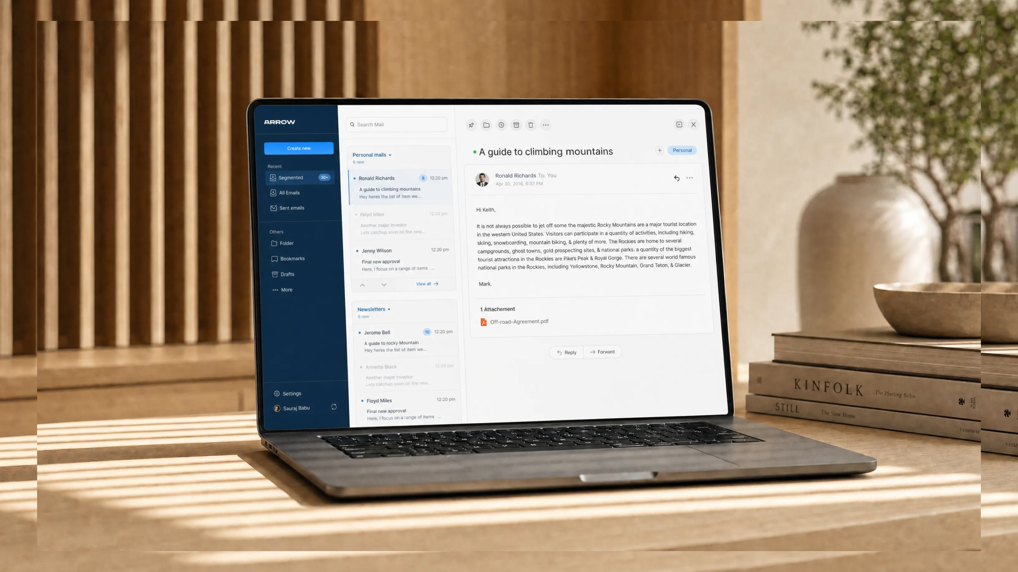
Arrow Mail is a concept email app designed to make multitasking, inbox organisation, and everyday communication feel faster, calmer, and easier to manage.
Loading 0%